Problem
Since its launch in the Fall of 2017, Destiny 2’s player base has been quickly declining.
There are several factors contributing to this, most notably the lack of fresh replayable content and sense of accomplishment, but others point to small “quality of life” or QOL issues. These issues are minor in scale, but in one way or another, they impede the player from accomplishing certain tasks within the game.
Opportunity #1
Redesign the in-game storage system to provide players with a more robust experience that incentivizes collecting all the items Destiny has to offer.
Destiny 2 is a loot-based game. That means there are tons of unique items to collect and use. But one issue many players point to is the lack of a well-designed Vault. The Vault is a player’s stash where they store all of the items they have collected while playing Destiny and the current design of the Vault interface and filter options makes it very difficult for players to manage all of their items.
Additionally, since there are so many unique items within the game for players to collect, there are bound to be players who are “Collectors” and will strive to collect every item. Destiny can take advantage of this mindset and provide players with a robust experience that provides the “Collector” with the appropriate information and tools to further incentivize them to go out and play and explore the world of Destiny. The best part is, this can be done with little UI/UX improvements to the current storage system, the Vault.
Redesigning the Vault for the ultimate collector.

Current Vault Interface
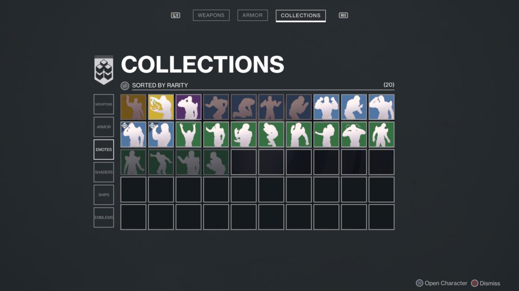
The current Vault design is complete chaos. It is almost impossible to find a specific item a player is looking for.
There is no categorization of items. All items from armor and weapons, to cosmetic items and vehicles, are grouped together in the Vault section.
The filtering options are barely noticeable and not clear.
The filtering options that are available, only let players filter based on rarity (how rare an item is), quantity, or newest (meaning the newest items acquired are listed first). And this is a problem because it doesn’t actually help the players filter down the items to help them find what they are looking for. The filtering options are completely useless to players.
There’s no ability to see what a player is missing and what still needs to be collected to fill out a specific set of gear.
Goals for redesign
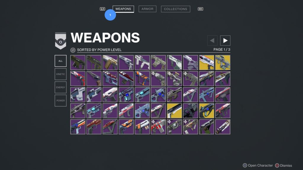
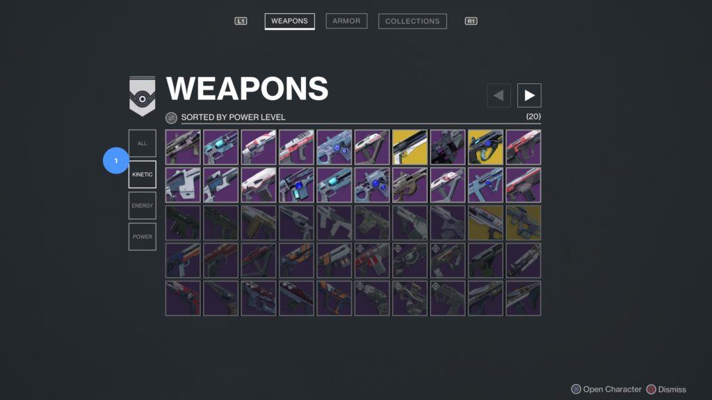
Allow for easy search and filtering so players can find specific weapons and armor quickly.
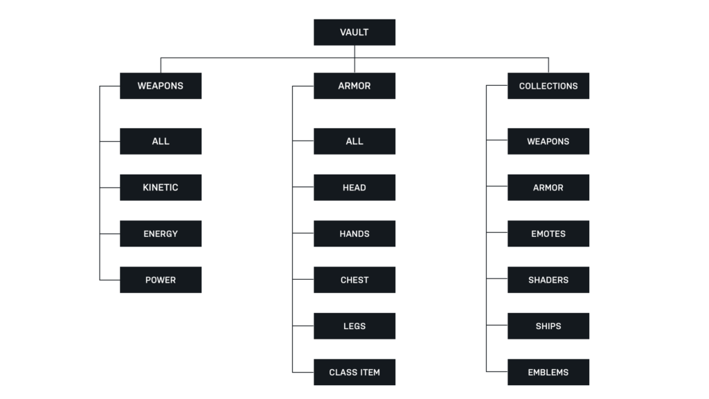
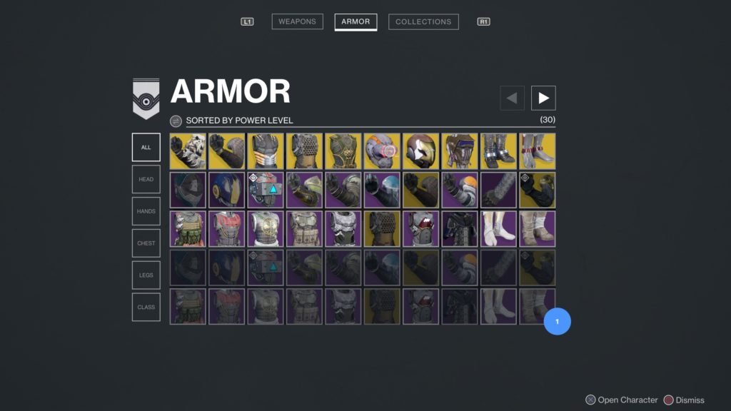
Categorize and separate the armor from weapons.
Categorize and separate the different types of armor.
Categorize and separate the different types of weapons.
Not only show what’s been collected, but also show what has not been collected to incentivize players to seek out their last remaining pieces of gear.
Old Vs. New Information Architecture
Proposed Redesign
Opportunity #2
Introduce an in-game matchmaking feature that enables players to group up efficiently without having to leave the game to use 3rd party applications.
Some of the most challenging and rewarding content in Destiny 2 requires players to group up in teams of 3, 4, and 6. However, the game does not provide a matchmaking service for some of these game modes and therefore forces players to rely on 3rd party applications to find other players and group up.
This is a problem for Bungie as the effort tends to dismay players and prevents them from even attempting these game modes and therefore experiencing some of the best content Destiny has to offer. Additionally, when players use these 3rd party apps, they have to stop playing Destiny, leave the game to access the 3rd party app from a different device, connect with another player, and then go back to Destiny to find the player they just met.
Creating an in-game feature that enables players to more efficiently find one another and group up to play the game.
Needs of the Players
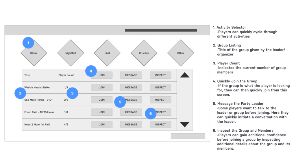
Find other players based on desired activity.
Ease of joining, inviting, and messaging.
Ability to check or “inspect” other players to provide confidence when joining or inviting others.
Method to do all of this within the game.
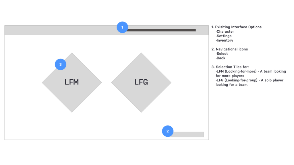
Introducing Destiny 2 Matchmaking
Find, join or create groups directly from the in-game interface.
Search for players or groups by desired activity.
Join groups or message players immediately from the matchmaking screen.
Make new friends by completing in-game activities.


