
Problem
Homeless people are ignored, they’re viewed as alien rather than human.
They’re overlooked.
Opportunity
70% of the homeless population are situationally homeless.
These are individuals and families who are faced with an unexpected life event and are forced to make tough life decisions. Unfortunately, this eventually snowballs until they end up homeless.
Challenge
How might we create empathy so we can inspire action?
Design objective
Create an experience that makes the user think “that could be me.”
OVERLOOKED
A data-driven and personalized storytelling experience intended to create empathy and inspire action to help the homeless.
Demo walk-through
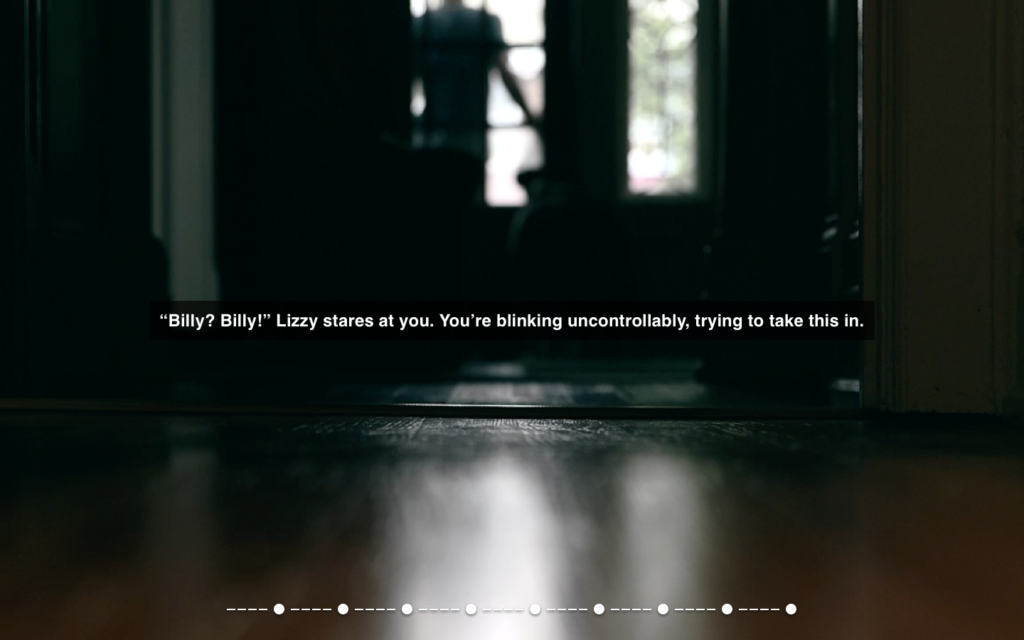
Overlooked is a data-driven and personalized “choose your own adventure” style interactive web experience. It tells a story of the user and forces them to make tough life decisions in an attempt to avoid becoming homeless. Information from the user’s Facebook profile, such as names of friends and family members, are placed into the story to create a personalized experience about the user and the people in their lives. And because the user is watching themselves and their friends and family members, and not interacting with some generic story, the emotional connection is much stronger as they’re actually thinking about their loved ones when faced with one of the choices in the story.
How it works
The experience is written with dynamic text and pre-determined decision trees. Once the user connects their Facebook account, the system pulls key information such as names of friends and family members, locations, places of work, and life milestones, to integrate into the story.
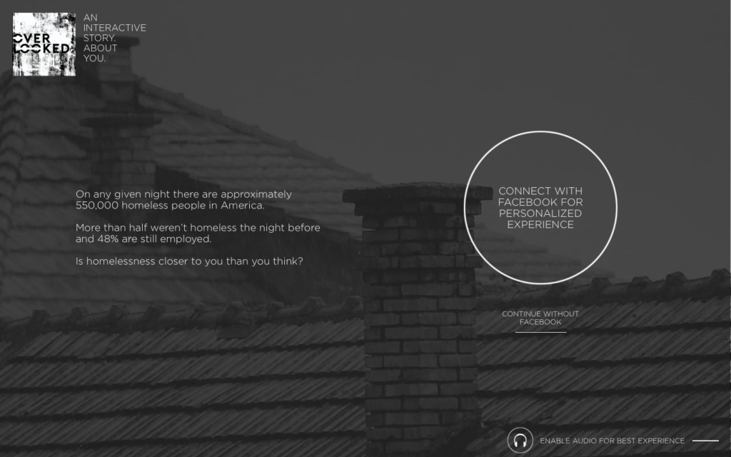
First, the user connects their Facebook account.
Their social data, such as names, is then placed into the text and the story begins.

At the end of each chapter, the user is asked to choose what they should do next. Each choice has their own outcome, leading the user down a new and unique path.

A decision tree from 1 of the 6 core life events
Six core life events
Every user’s experience is different. In our research, we found a trend among six core life-events that can initiate the treacherous path towards homelessness, and we use these life-events as the starting point of each story. And depending on the user’s social profile data, the most relevant and applicable life event will be used for their story and experience.
The six life-events are:
- Death of a primary breadwinner
- Extreme medical emergencies
- Unbalanced cost of living
- Job loss
- Job loss of a spouse
- Natural disaster
GOALS
Create empathy that anyone can become homeless and inspire action.
Taking action
Once the user has finished the experience we want them to then take action and either donate or volunteer at a local organization that helps the homeless, or at the very least, share their experience on Facebook to encourage more participants.
Because we know the user’s general location, we provide specific opportunities for them to help in their area. For instance, if the user is in Richmond, then they will be able to get involved with Richmond organizations rather than national ones. By providing localized organizations for the user to get involved with we are increasing the likelihood of a user taking action.
This also capitalizes on the idea of social capital, that people feel good about themselves and “earn” points amongst their cohorts when sharing that they themselves have done something good (like helping the homeless) or recommending a cool/unique experience (like Overlooked). These become a reflection of their own personal identity and their self-esteem rises.

Final call-to-action providing 3 quick ways to help
FEATURES
Interaction design
My approach
Based on my knowledge of psychology, I made very intentional decisions when designing this experience. I took special care to address and help users overcome the many cognitive barriers we inherently possess.
The landing page
Audio and visuals immediately set the serious mood and tone.
Subtle animations create curiosity and intrigue for the user.
Primary CTA skews the user’s attention and prioritizes itself as the preferred choice for the user.
Secondary CTA doesn’t resemble a clickable button until the user hovers over it.
Social profile integration
Progress bar communicates the system is preparing the experience.
Social photos animating on the screen lets the user know that information from their Facebook profile will be integrated into the experience.
Ultimately communicates that this is a unique and personalized experience.
This is when the user will begin to realize that the experience is going to use information from their Facebook account and is intended to peak their curiosity and make them lean into the experience with intrigue right before it begins.
Progress bar
The progress bar along the bottom acts as a secondary reinforcer.
It communicates to the user their current place within the whole experience, and how much is left.
This improves user engagement as well as reduces bounce rate.
The ‘click to continue’ CTA animates in drawing the user’s attention, indicating that this scene has finished and the user can continue to the next scene. In the prototype, the videos play on a loop and I did not want the user to become confused when this happened so I timed the ‘click to continue’ button to animate in at the exact time the scene came to end.
Choices have weight
Three choices are presented to the user, each with their own outcome, leading the user down a new and different path.
Hover animations reveal more information about each choice.
The choices are ordered and framed from one extreme to the other, so users can quickly compare the outcomes of each choice.
Wanted the user to feel like each choice had weight to them and for the user to really be sure of their decision before they choose.
To accomplish this, the user must click and hold on their selection while the outline of the choice fills up.
This truly immerses the user into the experience, as they are now weighing each option against one another and how they will ultimately affect themselves and their loved ones. This begins to create empathy.
Once the user makes their decision the outline of the choice they selected expands and takes over their screen intended to create a tunnel-like effect to further communicate that they’re now heading down a new and different path based off their choice.
My role
After researching and talking to organizations, I concepted and created the idea. I worked with my team to map out the experience, logic, and decision trees. And I designed and prototyped the experience within Sketch and Principle.
Group members
Brian Marcolini, CW
Shang Yang, AD